
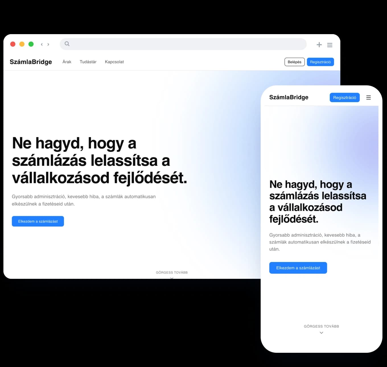
A bridge between Stripe and Hungarian invoicing
Szamlabridge is a classic middleware solution, bridging the gap between Stripe and Hungarian tax regulations.
Stripe is one of the world’s most popular payment gateways, but on its own it cannot pass data properly to Hungarian NAV-connected systems such as Számlázz.hu. Merchants were left with two options: issue invoices by hand, or build a custom API integration for every single webshop.
Szamlabridge is a “set-and-forget” automated tool. The MVP phase, however, focused primarily on functional operation, at the expense of the user experience.
The journey of invoicing data
What did the MVP interface get wrong?
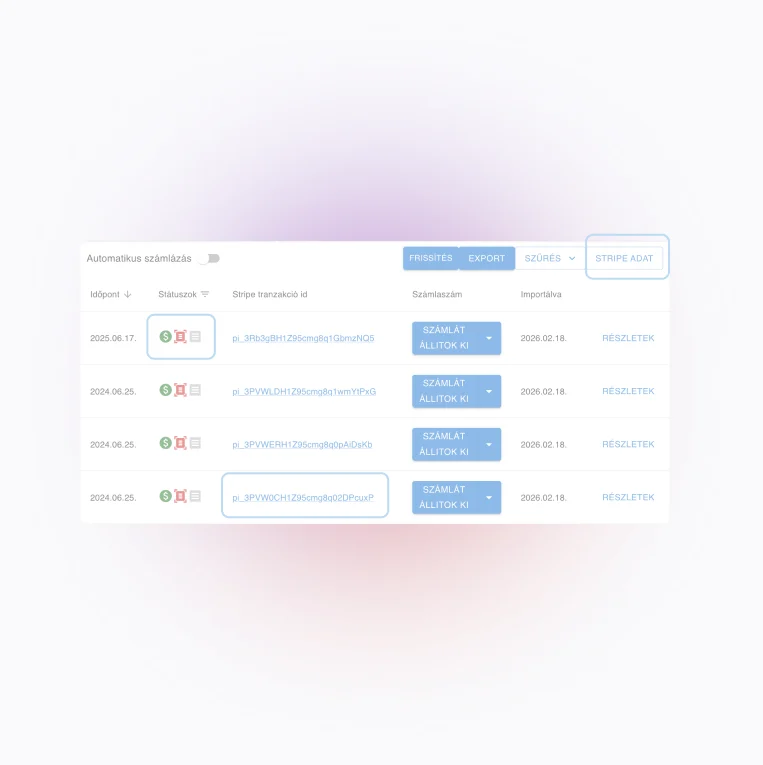
Icons that don’t speak
The icons carried too little context on their own; users had to “learn” their meaning, raising the entry barrier. A single icon tried to describe the status of each stage, giving too little feedback about errors.
Misleading names
The “Stripe data” button gave no hint that this was where the table’s columns could be edited.
Data overload
Stripe IDs dominated the table, crowding out the business data that actually mattered, such as statuses and payment details.
Exclusive filters
The filter worked on only one criterion at a time: status and date range couldn’t be combined, so finding a specific transaction became slow trial and error.
Developer logic imposed on the UI
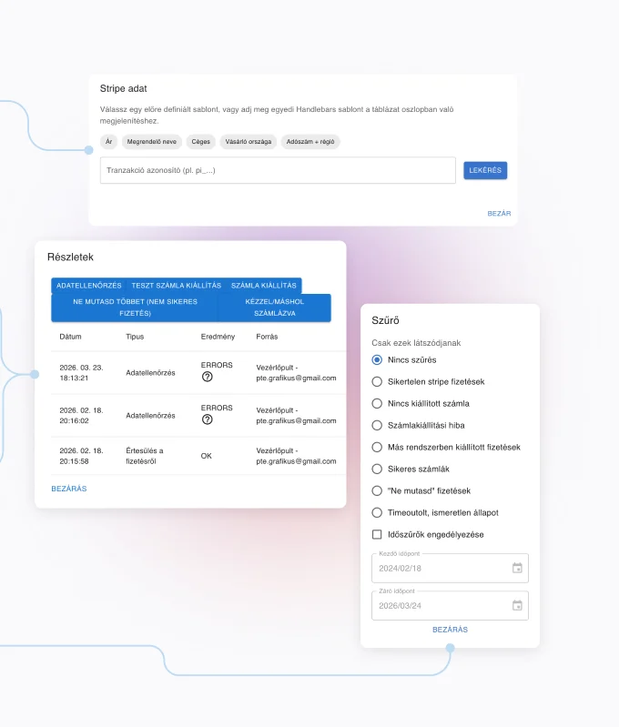
The original interface required users to understand the system’s internal architecture. The software pushed its own core task, fetching and structuring data, back onto the user in the form of templates: they had to know the deeper layers of Stripe’s metadata fields.
Details as a cognitive maze
Users had to deduce the real cause of an error from technical logs in the history list, tiny icons and vague tooltips, then find the fixing feature without any guidance.
Forced popups
Critical business actions such as “Issue test invoice” or “Data check” were only reachable behind “Details”. Even a simple operation required opening a popup.
A business interface instead of developer logic
Proactive error handling and diagnosis
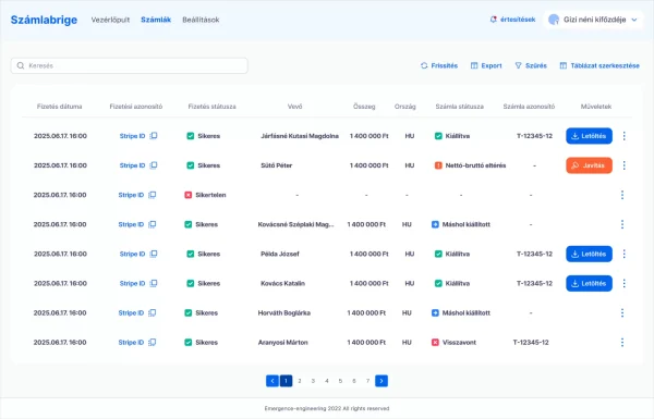
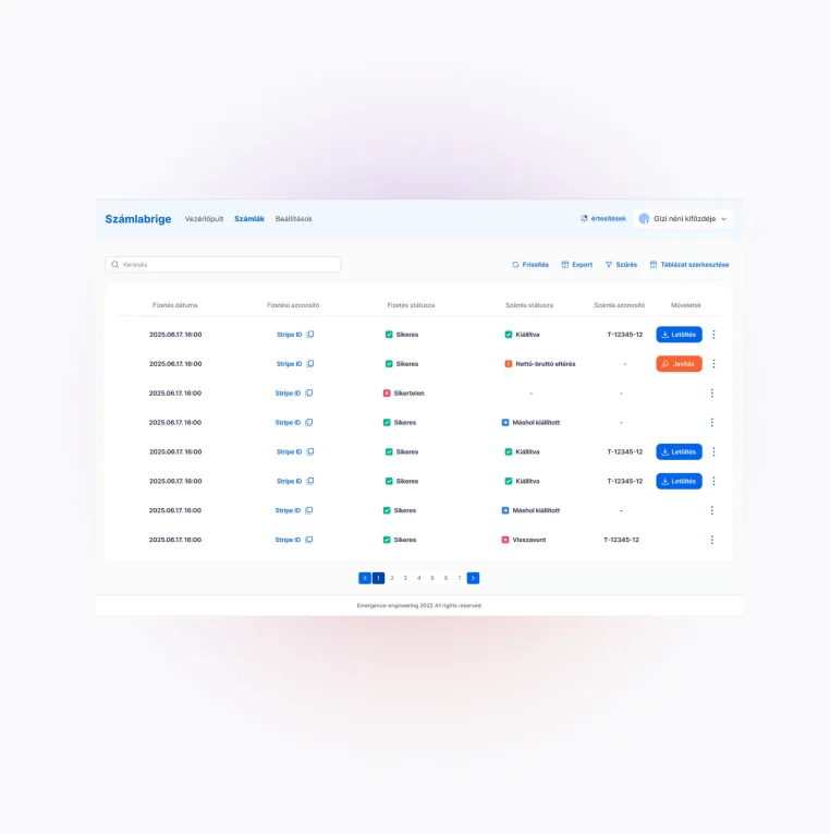
The hard-to-spot, uncertain tooltip messages were replaced with a decision-based troubleshooting mechanism. We introduced a prominent “Fix” button and its intelligent popup, which explains the exact cause of the error in plain language and offers immediate, one-click fixes.
Editing the table
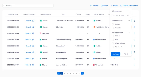
We replaced the misleading “Stripe data” label with the plain “Edit table”. A modern, column-based editor takes the technical burden off the client: users simply pick which columns they need (Customer, Country, Amount).
We realised users never read the long identifiers dominating the table; they only copy them or use them as references. We turned the ID into a shortened, clickable, copyable link, freeing up critical space on the screen.
Flexible, combined filtering
We rethought filtering from the ground up: instead of the previous exclusive choices, we built a more flexible, transparent panel. Users can now apply several criteria at once, combining status with a date range, for example, making specific transactions much faster to find.
Good interfaces hide complexity under the hood
Developer-minded interface design often forces the system’s internal logic and technical parameters onto the user, creating significant cognitive load and uncertainty. The lesson of this project: real user experience begins when software hides technological complexity “under the hood” and offers a plain, business-decision-driven interface instead.
When errors occur, instead of passive diagnosis the system should offer a guided process through noticing, understanding and acting, giving clients without special expertise the grounds to become confident decision-makers.
Could your software do more with a better interface?
With a UX audit we’ll show you where you lose your users, and what to fix first.
Thirty minutes, no pitch deck. If we don’t see a fit, we’ll tell you at the end of the call.