
User interviews
We talk to real users to uncover their needs, motivations and frustrations.
Customers don’t separate the ad, the website and the product. They experience it as one, and they decide where the friction is greatest. We start where the revenue leaks.
We start with research, write a hypothesis, and measure whether it worked. If it didn’t, we write that down too.







Most projects start with one area, then expand. That’s why every component goes into a reusable system, not a one-off screen.
We go through the analytics, the funnel and the critical journeys. By the end you know exactly what brings the most over the next 90 days, and how much.
Each phase answers a specific question: what does the user want, how do they get there, and does it actually work. The design happens in between.
Before we draw anything, we look at the analytics and talk to five to ten users. Most conversion problems already surface here.
Request the auditWe talk to real users to uncover their needs, motivations and frustrations.
Diaries, kits and tasks that map everyday habits and emotions.
Examining market patterns for opportunities to differentiate and grow.
Tracking user behaviour: what grabs attention, and where things need fixing.
Research becomes a prototype, the prototype becomes a build-ready screen. Every decision comes with a hypothesis we can verify later.
Organising content into a logical, easy-to-navigate structure.
Interactive models for testing ideas and refining the journeys.
Consistent interfaces that express your brand and stay coherent.
Making the touchpoints visible so we can find the opportunities to improve.
You find out what it was all worth after launch. That’s why we measure, test and improve in the first months.
See the full process→We watch how people use it, to see where they get stuck.
Comparing design variants to find out which one performs better.
Lightweight tests to gauge interest before we build a new feature.
Organising content the way users actually think about it.
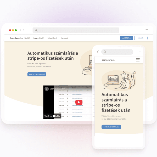
We redesigned the interface of the middleware bridging Stripe and Hungarian invoicing: proactive error handling, understandable table editing and flexible filtering. The technocratic MVP became software that supports confident decisions.
Full case study→Startup products we joined early, and Hungarian websites we designed and developed ourselves.
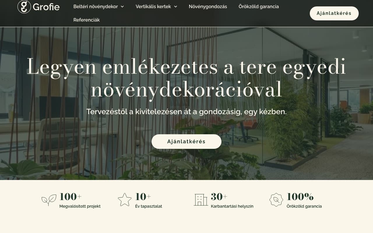
The website of a premium office plant-decoration brand: a guided path from design to installation, with a quote-request funnel.
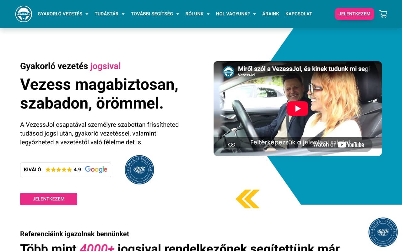
The practice-driving site we redesigned: +93% conversions at half the lead-acquisition cost.
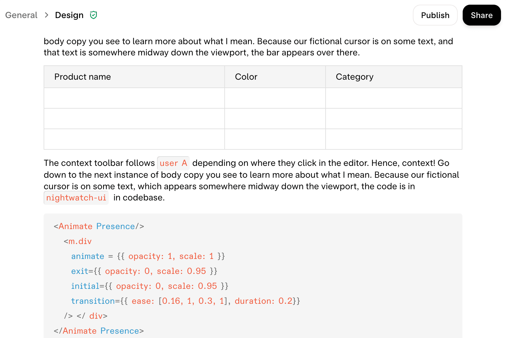
We developed key features for their end-to-end encrypted collaboration platform. The result: acquisition by Notion.
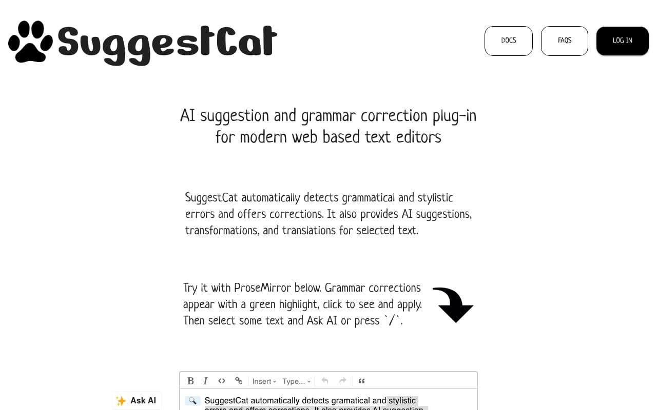
An AI plugin for rich-text editors: grammar correction and text completion, built on ProseMirror.
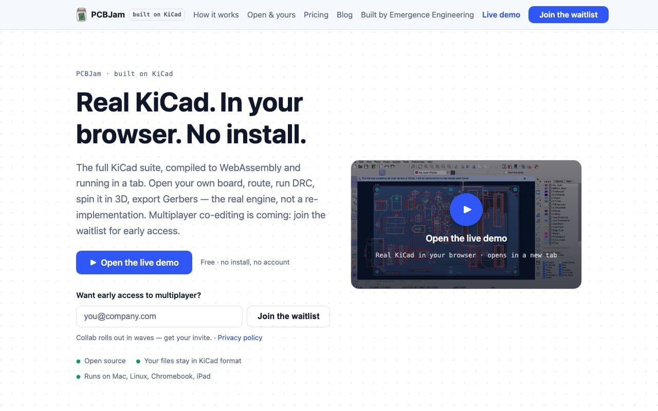
A full PCB-design suite running entirely in the browser via WebAssembly. Featured on Hacker News.
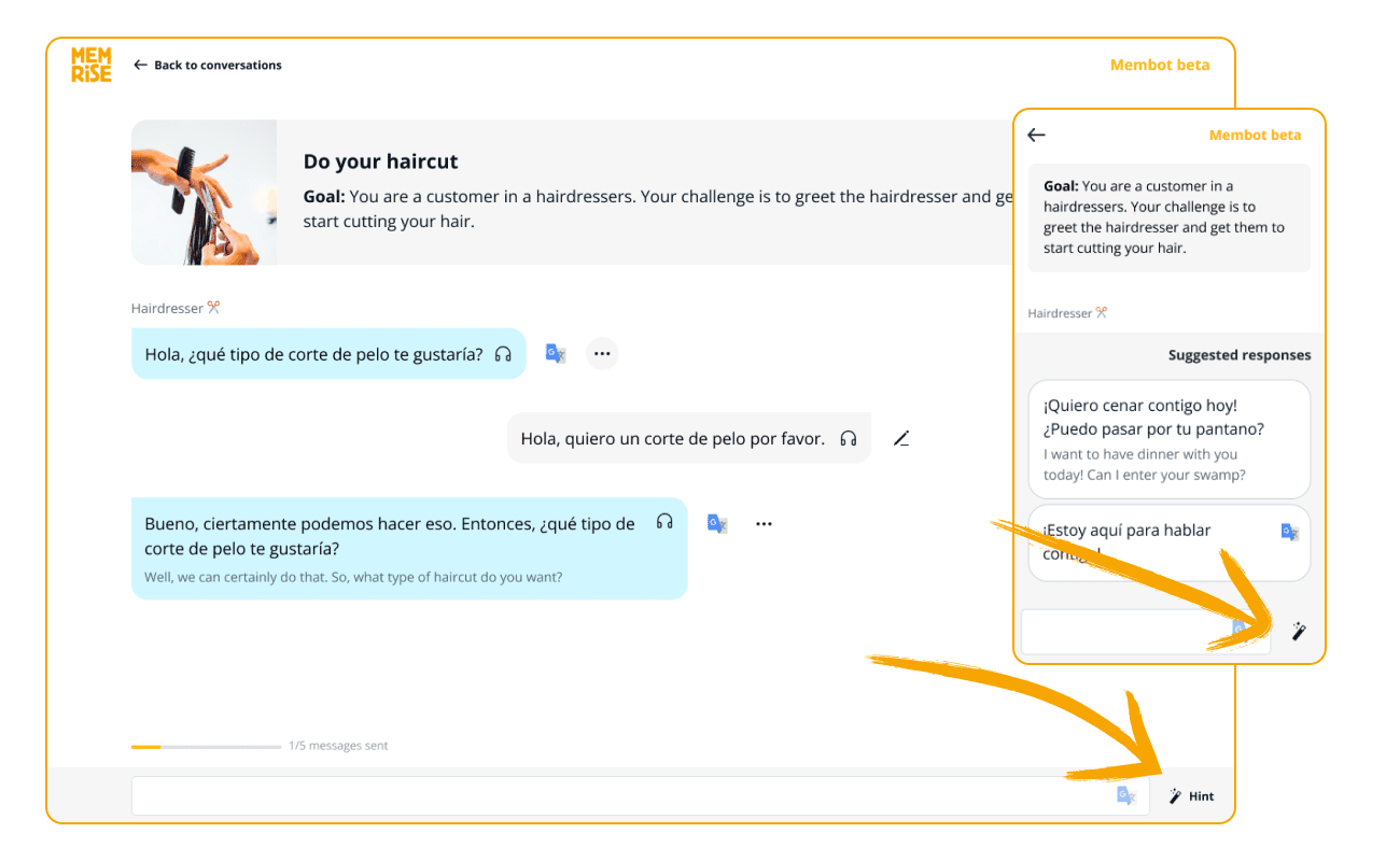
An AI-powered conversational tutor giving learners instant feedback on speaking and pronunciation.
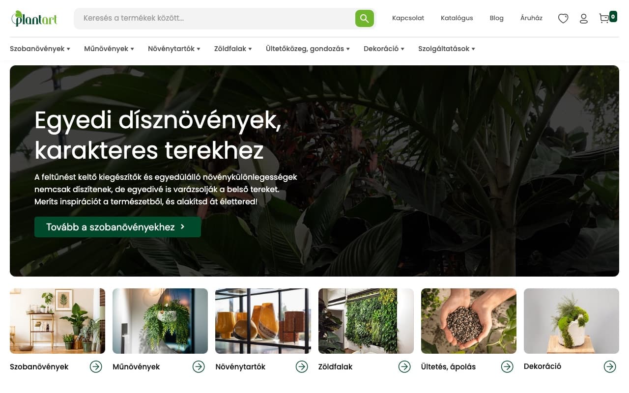
A plant webshop we designed and developed: search, categories and a purchase path for a HUF 1.9 billion brand.
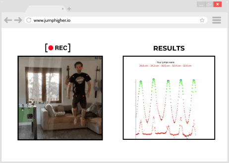
A motion-analysis platform we built to track and coach users’ progress.
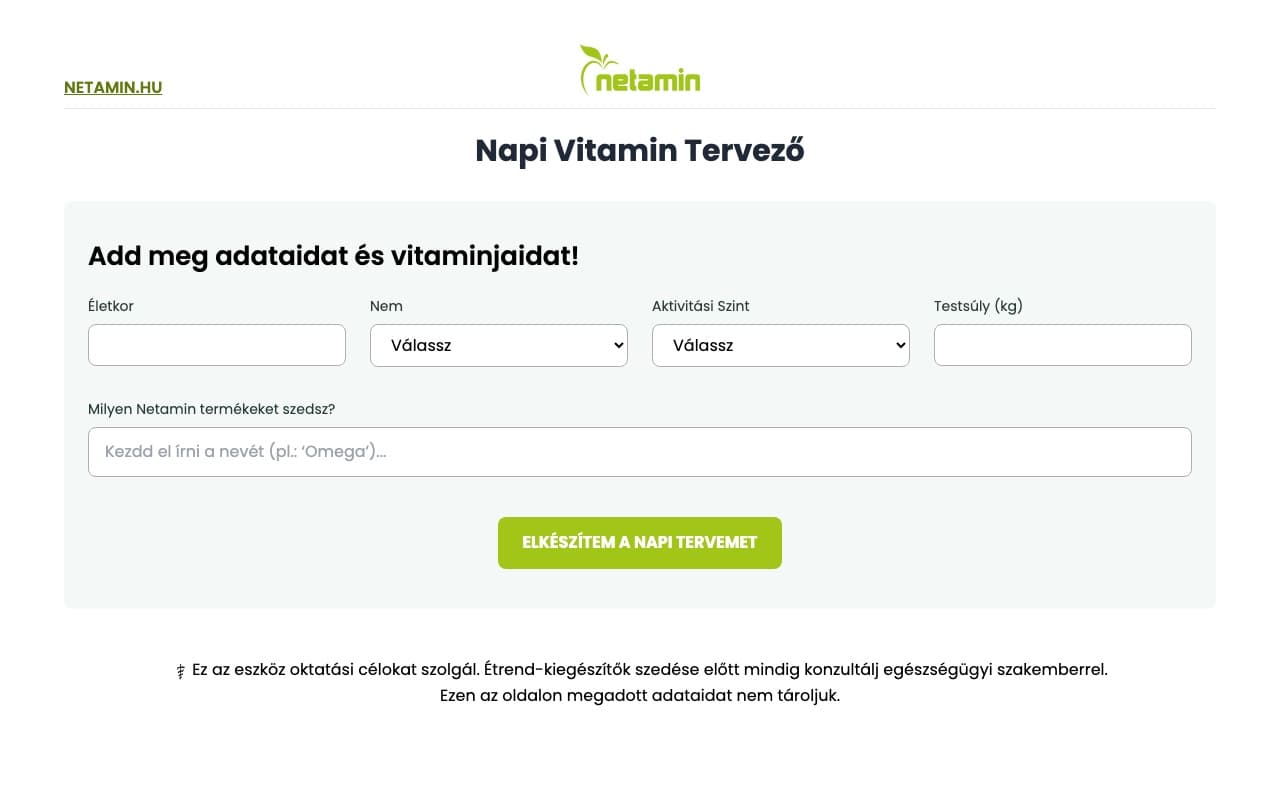
A daily vitamin planner we built for Netamin: a personalised dosing plan in a few clicks.
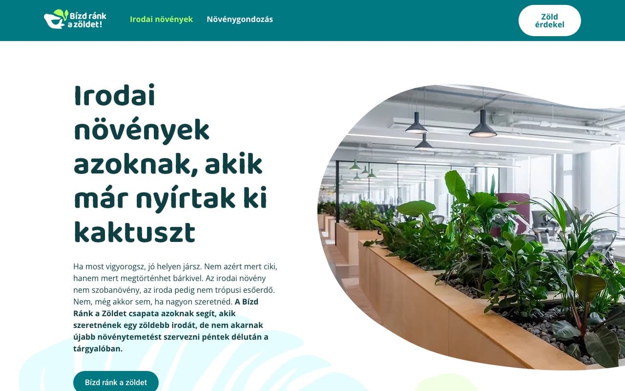
A service site for office plants and plant care: conversion-focused copy and a clean quote-request path.
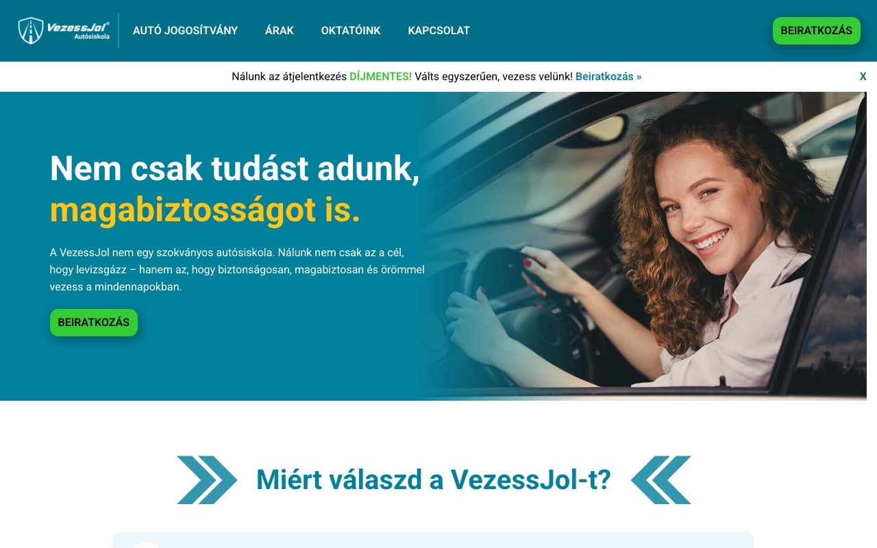
The new driving-school branch's site from scratch: an enrolment funnel with E-Titán integration.
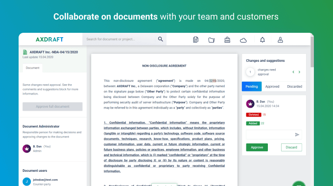
A specialised legal document editor for law firms, built for real-time collaboration.
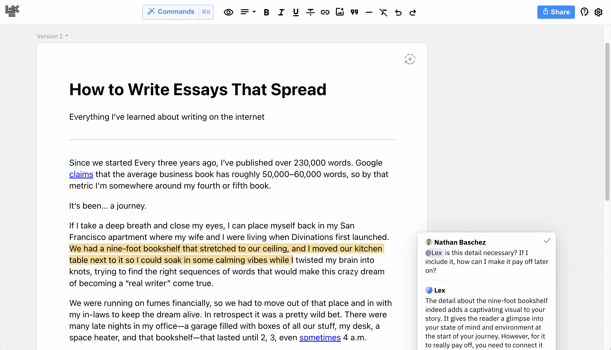
A collaborative text editor for writers and their editors.
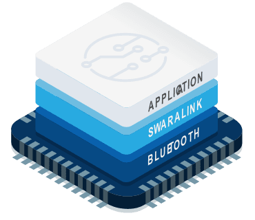
A testing framework for a new Bluetooth product, ensuring production quality on the factory line.
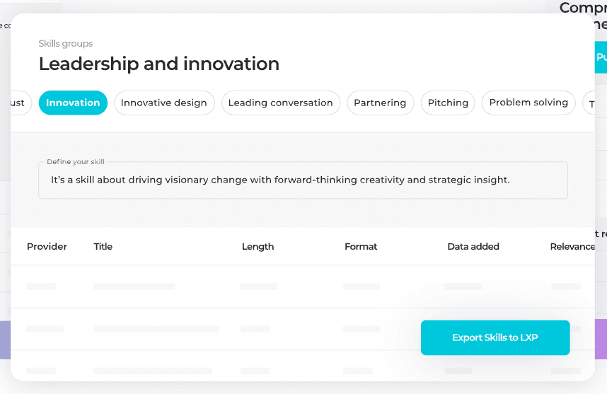
A solution that helps firms organize their content for easier everyday use.
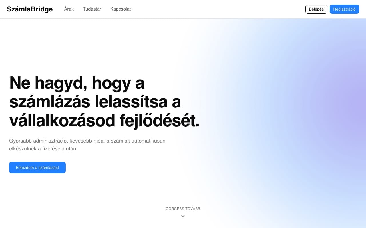
Middleware that turns Stripe payments into compliant invoices automatically, with proactive error handling.
We start by listening. Through research and conversation we learn the goals, the users and the market.
The findings become a prioritised roadmap, where every decision serves a business goal.
Wireframe, prototype and visual design, with measurable hypotheses, not taste debates.
Build-ready screens, documented components, and support during implementation.
Measure, test, iterate. The design is done when the number moves.
You know your business. We know how to turn it into UX/UI design that performs. Let’s talk and make an experience that looks good and works well.
Thirty minutes, no pitch deck. If we don’t see a fit, we’ll say so at the end of the call.